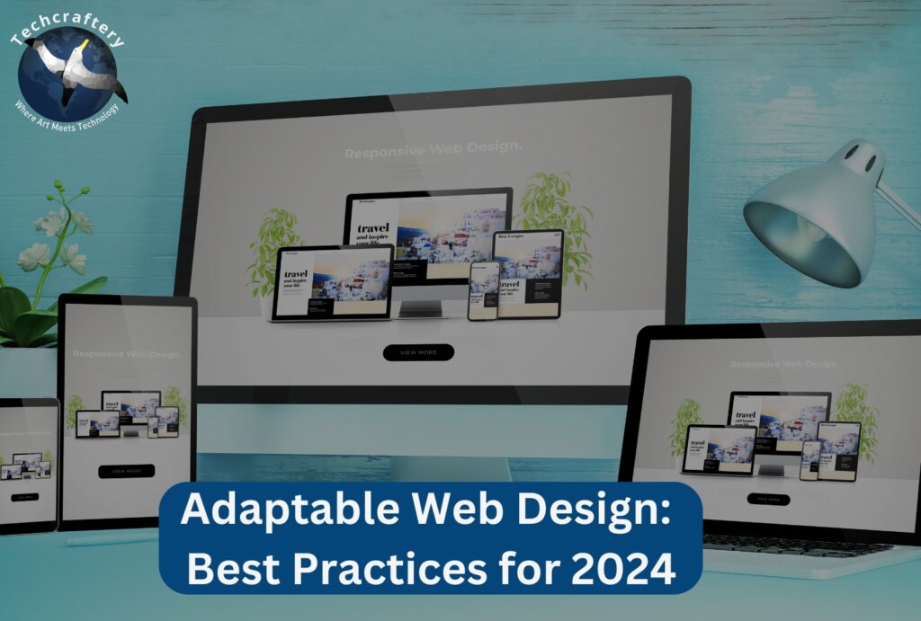
Adaptable Web Design: Best Practices for 2024

In the fast-evolving digital landscape, web design has shifted significantly over the years. As devices and technologies change, the need for adaptable web design has never been more crucial. In 2024, creating websites that provide a seamless user experience across all platforms is not just a trend; it’s a necessity. This article explores the best practices for adaptable web design, ensuring your site is user-friendly, functional, and aesthetically pleasing.
What is Adaptable Web Design?
Adaptable web design refers to the ability of a website to change its layout and features based on the screen size and capabilities of the device being used. Unlike responsive design, which often relies on flexible grids, adaptable design can utilize distinct layouts tailored for different devices. This means that a website might present a different experience for mobile users compared to desktop users, ensuring optimal usability and engagement.
Key Features of Adaptable Web Design
- Fluid Grids: Grids that adjust based on the screen size.
- Flexible Images: Images that scale to fit the layout while maintaining their aspect ratio.
- Media Queries: CSS techniques that allow the application of different styles based on device characteristics.
- Content Prioritization: Different content can be displayed or hidden based on the device to enhance user experience.
Why is Adaptable Web Design Important?
- User Experience (UX): A seamless user experience across devices is crucial. Users expect websites to work smoothly whether they’re on a phone, tablet, or desktop.
- SEO Benefits: Google prioritizes mobile-friendly websites in its rankings. An adaptable design can improve your site’s visibility and traffic.
- Reduced Bounce Rates: A site that functions well on all devices will keep users engaged and reduce bounce rates.
- Increased Accessibility: Adaptable design can help ensure that all users, regardless of their device or abilities, have access to your content.
Best Practices for Adaptable Web Design in 2024
1. Prioritize Mobile-First Design
The mobile-first approach focuses on designing for smaller screens before expanding to larger devices. This practice ensures that mobile users, who make up a significant portion of web traffic, receive the best experience.
Tips:
- Start with a mobile design that includes essential features.
- Gradually add features for larger screens.
- Test your designs on various devices regularly.
2. Utilize Fluid Grids
Fluid grids are essential for adaptable design. Unlike fixed-width grids, fluid grids use percentages instead of pixels, allowing content to resize according to the screen.
Implementation:
- Use CSS Grid or Flexbox to create fluid layouts.
- Define widths in percentages to ensure flexibility.
- Ensure that elements stack vertically on smaller screens.
3. Optimize Images and Media
Images and videos can significantly impact loading times, especially on mobile networks. Optimizing these elements is crucial for performance.
Best Practices:
- Use responsive images with the
srcsetattribute to deliver different sizes based on the device. - Compress images without losing quality using tools like TinyPNG or ImageOptim.
- Utilize lazy loading for images and videos to improve initial load times.
4. Implement Media Queries
Media queries allow you to apply different styles based on the characteristics of the device, such as its width, height, and resolution.
Example:
cssCopy code@media (max-width: 768px) {
  body {
    font-size: 14px;
  }
}
Tips:
- Use media queries to adjust layouts, fonts, and visibility of elements.
- Combine multiple conditions to create sophisticated responsive designs.
5. Maintain Content Hierarchy
Content hierarchy is vital for guiding users through your site. Prioritize the most important information, especially on smaller screens where space is limited.
Strategies:
- Use headings (H1, H2, H3) to structure content logically.
- Ensure CTAs (Call to Action) are prominent and easy to access.
- Hide less important content on smaller screens but ensure it’s available for larger devices.
6. Ensure Cross-Browser Compatibility
Your website should function seamlessly across all browsers and devices. Testing for compatibility is essential to reach a wider audience.
Approach:
- Use tools like BrowserStack to test your site on various browsers.
- Regularly check for updates in browsers that may affect your design.
- Validate your HTML and CSS to avoid issues.
7. Focus on Speed Optimization
Page load speed significantly affects user experience and SEO rankings. An adaptable website should be optimized for quick loading times.
Optimization Techniques:
- Minimize HTTP requests by combining files (CSS, JavaScript).
- Utilize browser caching to store elements locally for returning visitors.
- Employ Content Delivery Networks (CDNs) to speed up content delivery.
8. Design for Accessibility
An accessible website ensures that all users, including those with disabilities, can navigate and interact with your content.
Accessibility Tips:
- Use ARIA (Accessible Rich Internet Applications) roles and properties.
- Ensure sufficient color contrast between text and background.
- Provide alt text for images to assist screen readers.
9. Simplify Navigation
Navigation is a critical element in web design. It should be intuitive and easy to use, especially on mobile devices.
Best Practices:
- Use a hamburger menu on mobile devices to save space.
- Keep navigation items to a minimum; consider using dropdowns for subcategories.
- Ensure that the search function is easy to find and use.
10. Test and Iterate
The best way to improve your adaptable web design is through constant testing and iteration. Gather user feedback and analytics to inform your decisions.
Testing Methods:
- Conduct A/B testing to compare different layouts or features.
- Use heatmaps to understand user behavior on your site.
- Regularly update your design based on user feedback and technological advancements.


